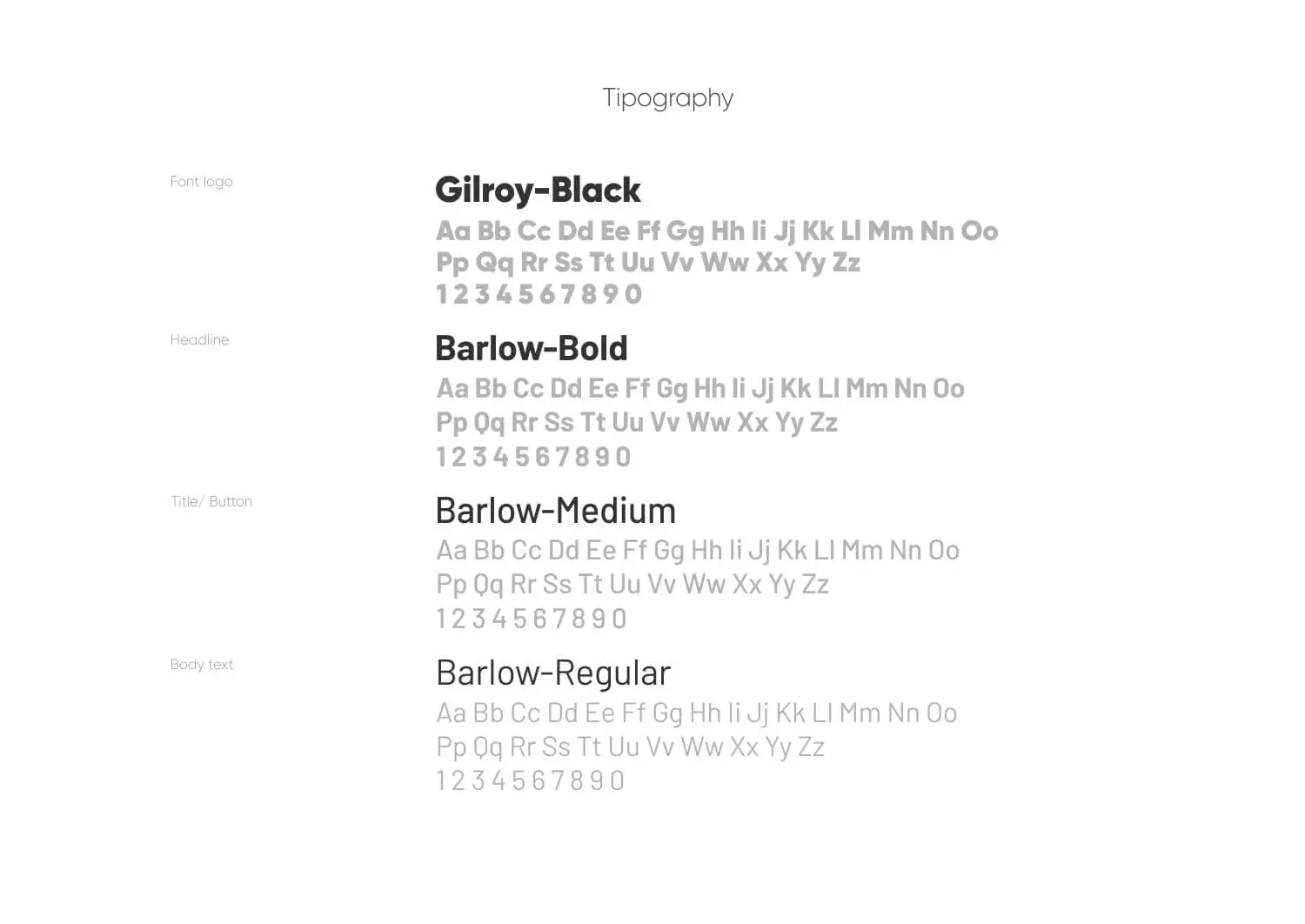
The Jakarta Party brand that we designed needed a design system that could be implemented into a website. With a trendy visual approach the Jakarta Party logo looks iconic using the letters J and P which are initials. The “Jakarta Party” design system is vibrant and modern, focusing on versatility and brand consistency.
Logo Design
Main Logo: The primary logo features the letters ‘JP’ intertwined in a stylized manner. The colors used are bright and playful, including yellow, pink, blue, and green. This colorful combination gives the logo a lively and festive feel.
Text: Below the ‘JP’ symbol, the text “Jakarta Party” is displayed. ‘Jakarta’ is in a bold black font, while ‘Party’ is in a playful script font that uses the same colors as the ‘JP’ symbol, maintaining a cohesive look.

The color palette chosen is bright and pastel colors based on the characteristics of the products offered by Jakarta Party.

The icon set designed is also based on the Jakarta Party logo design system as a relevant and consistent guide.