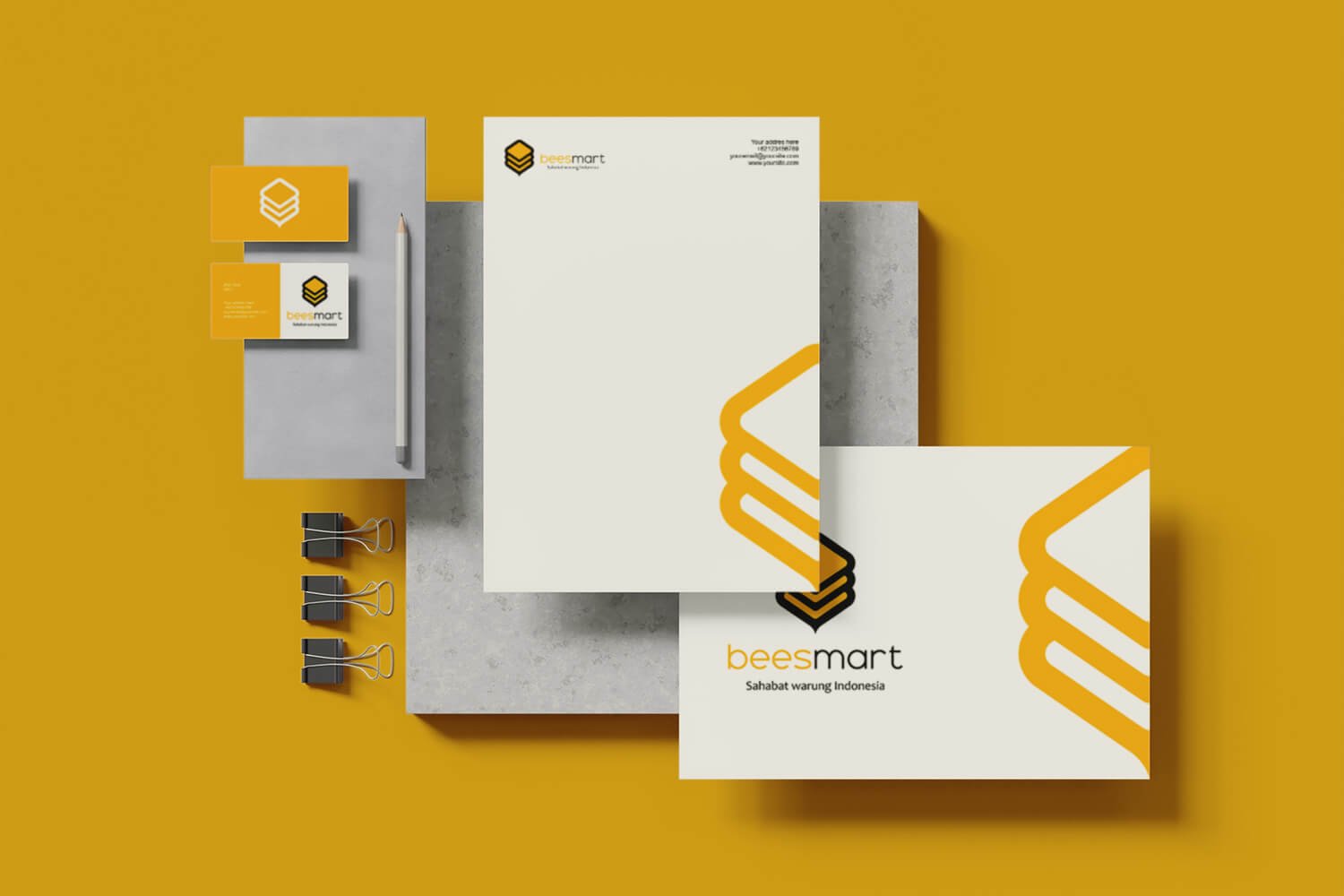
Beesmart approached our studio to design a modern and iconic brand identity. Of course we welcomed the request and started the work by communicating intently with a representative from Beesmart, who explained in great detail about the vision of Bessmart.
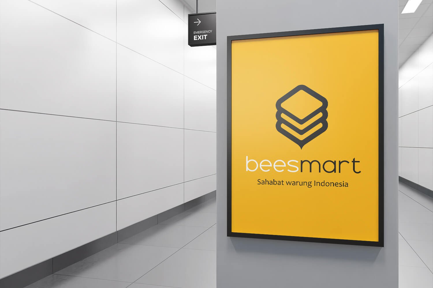
The Beesmart logo uses the basic shape of a hexagonal which is a representation of a beehive. The shape is then developed to resemble a bee by accentuating the black-yellow color and placing the stinger at the bottom of the hexagon.
The logo consists of three hexagons stacked on top of each other, meant to represent Beesmart’s service of selling goods in bulk.