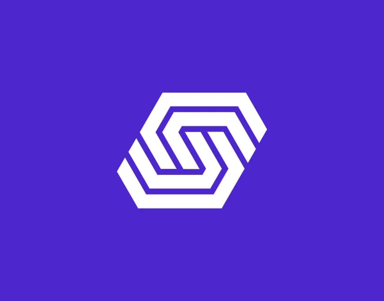

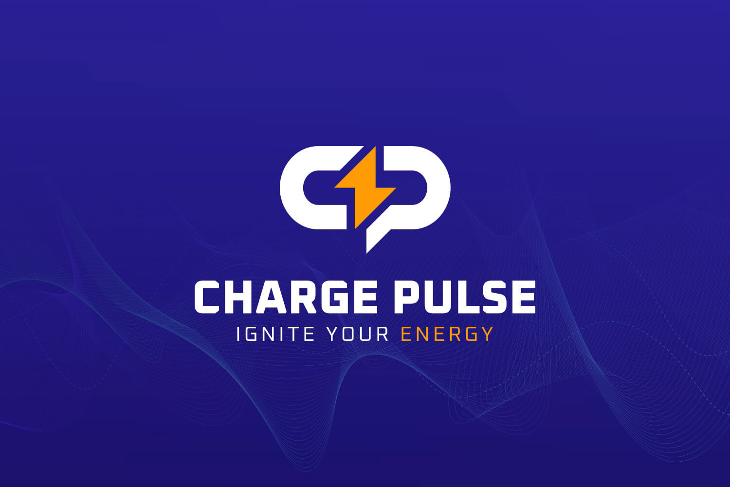

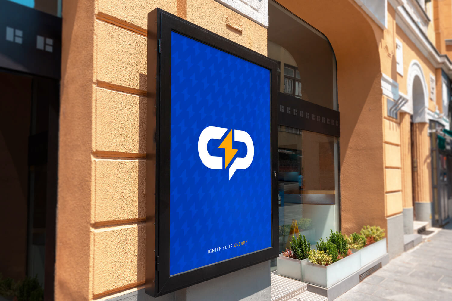
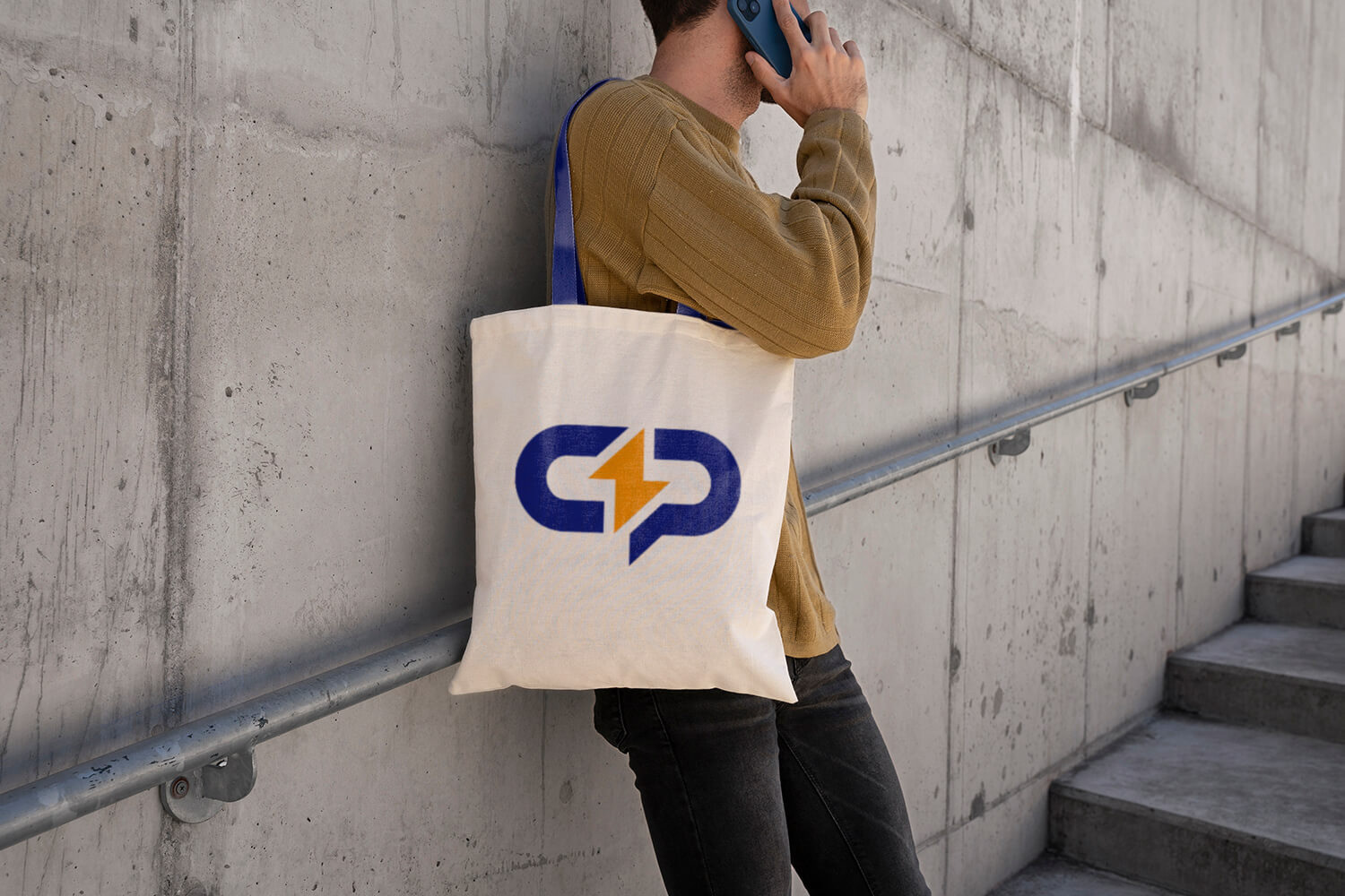
⚡ Charge Pulse — Energy Drink Brand Logo (Concept / Rejected Direction)
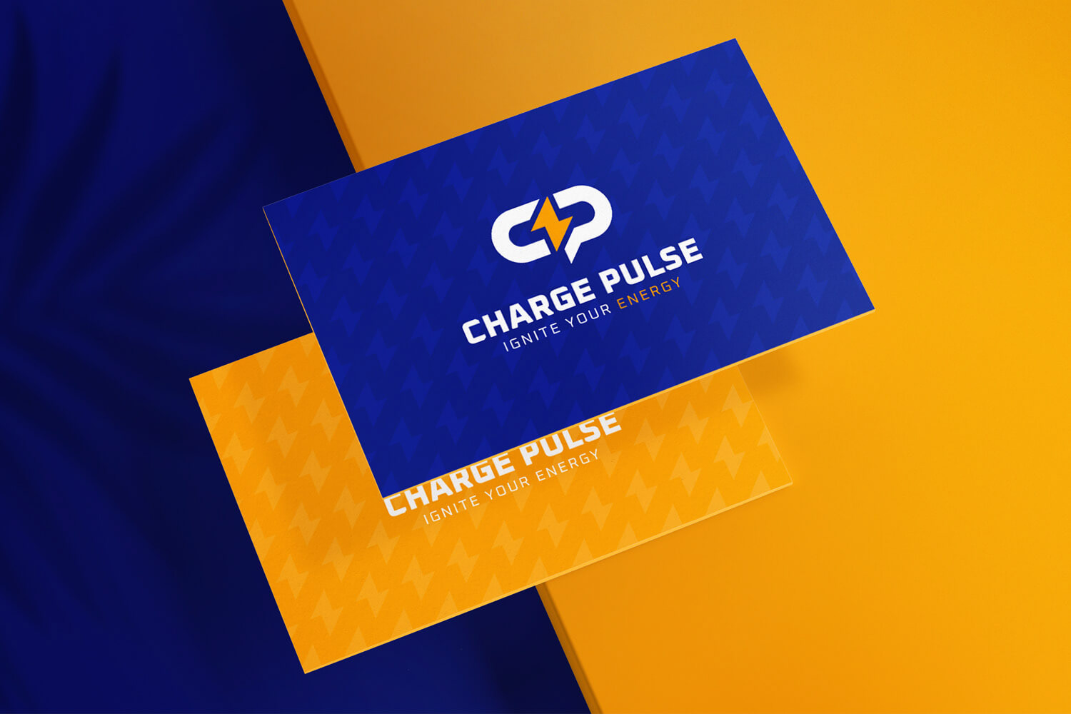
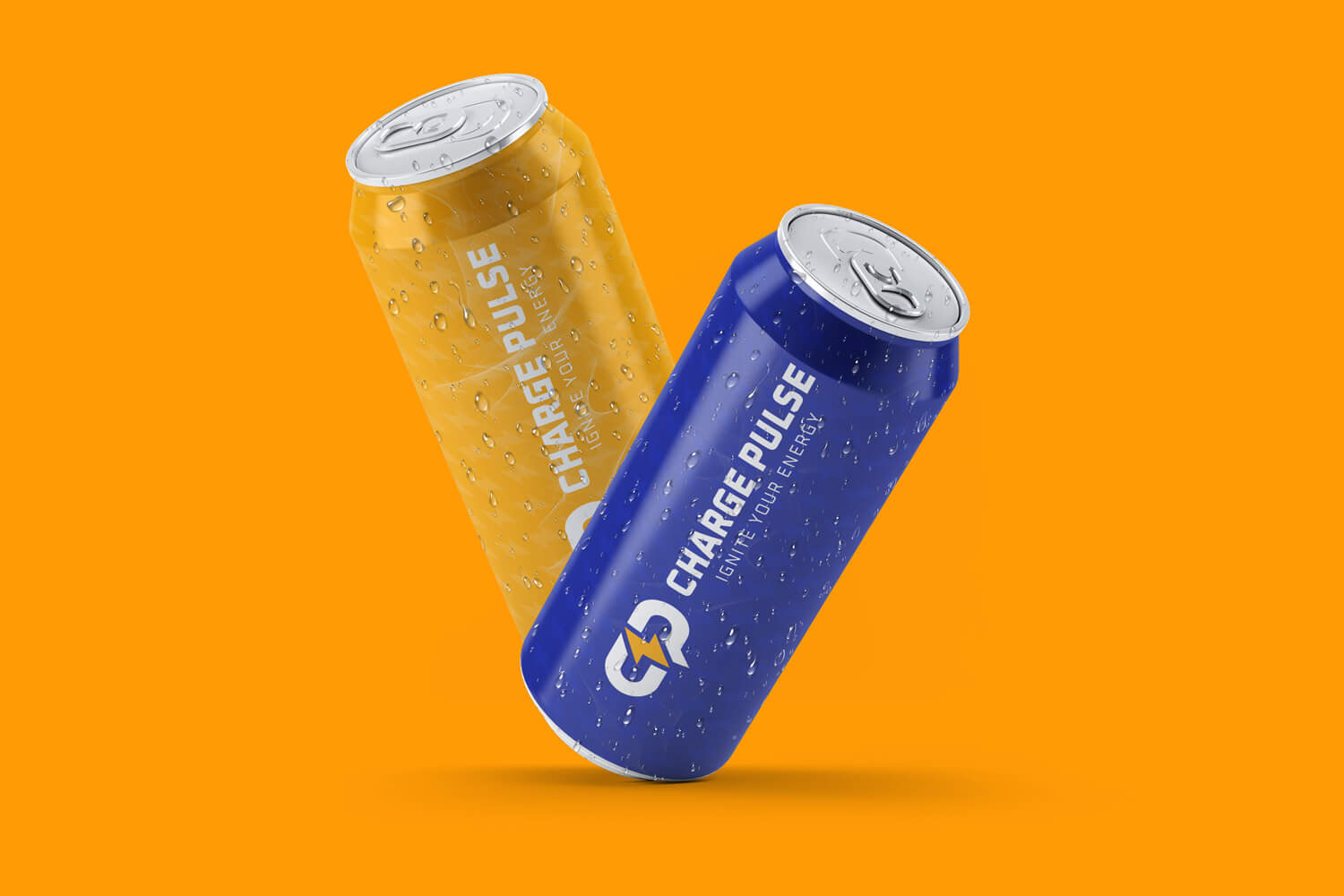
Charge Pulse is a logo concept created for an energy drink brand focused on power, motion, and instant impact. Although this direction was ultimately not selected by the client, I’m sharing it here as a conceptual exploration of how visual identity can communicate energy, speed, and modernity in the beverage industry.
The core idea was to combine a bold monogram (CP) with a lightning bolt symbol to instantly express the brand’s promise: ignite your energy. The lightning element works both as a visual metaphor for power and as a dynamic separator that creates rhythm and movement within the mark.
Concept Highlights
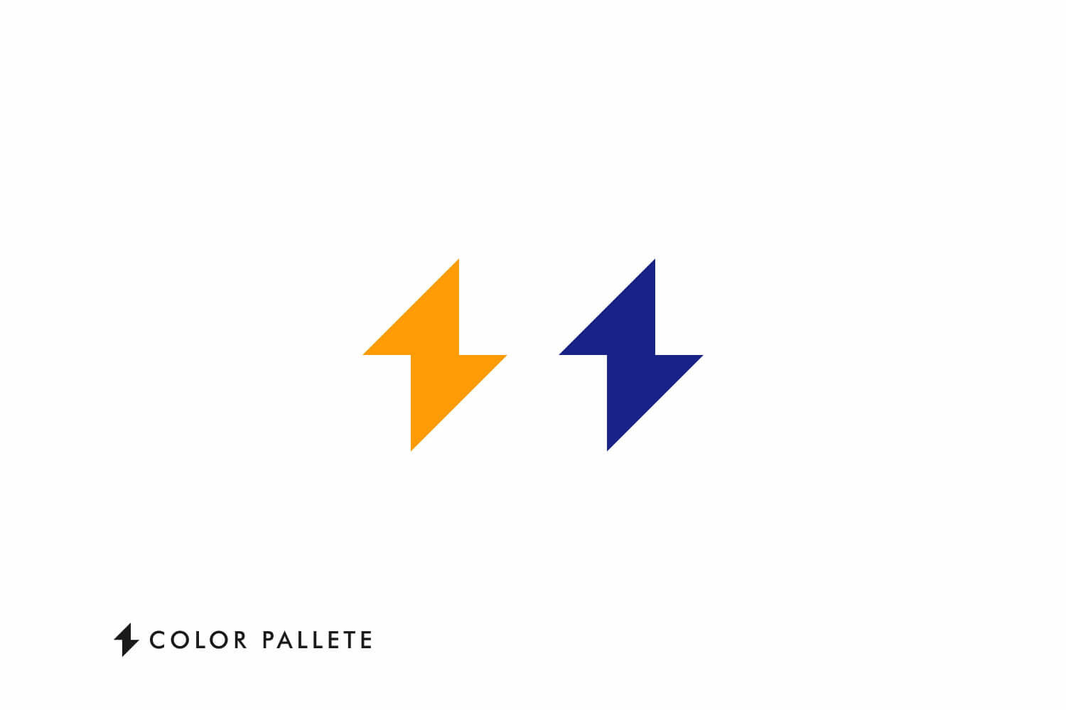
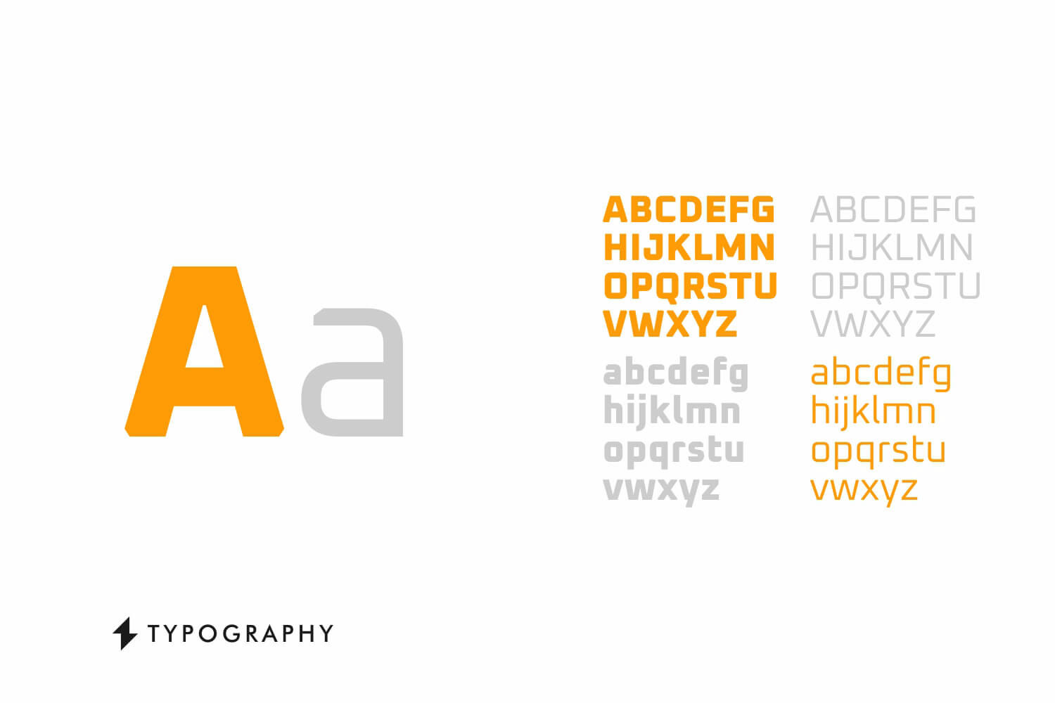
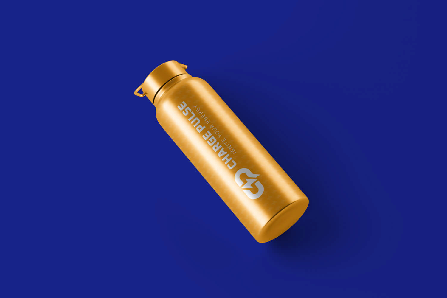
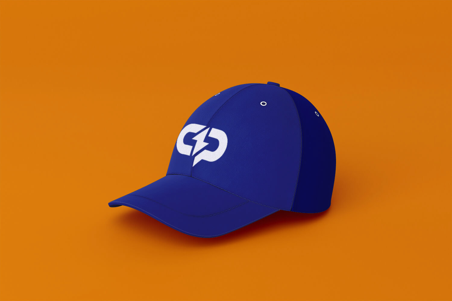
Monogram-based logo combining “C” and “P” for strong brand recognition Lightning bolt icon as a universal symbol of energy, power, and speed bold geometric typography for a modern, athletic, and high-impact feel Vibrant electric color palette to reinforce excitement and stimulation designed to work well across packaging, digital, social media, and merchandise.
Design Goal
The goal was to create a logo that feels:
⚡ Energetic — instantly recognizable and dynamic
🚀 Modern — suitable for a contemporary lifestyle brand
💥 Impactful — strong enough to stand out on crowded shelves and digital platforms
Even though this version was not chosen by the client, I believe it represents a strong visual direction and demonstrates how branding decisions evolve through exploration and iteration.