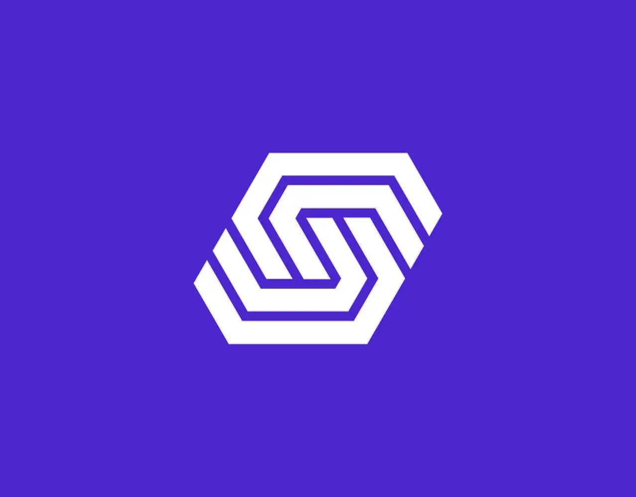

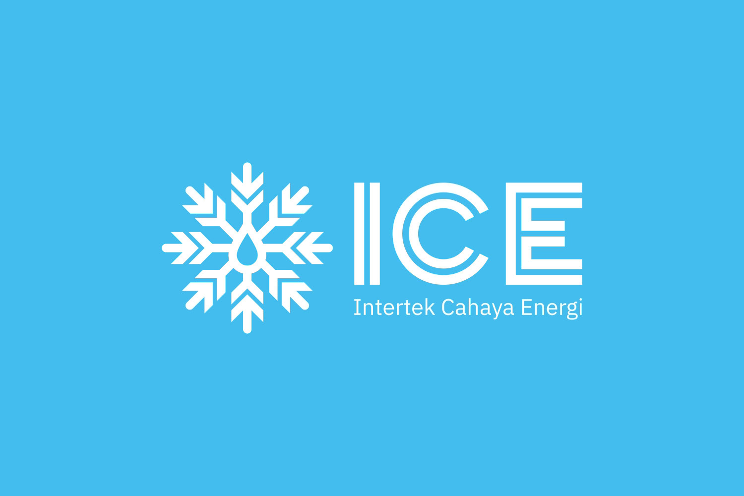


PT. Intertek Cahaya Energi (ICE) — Logo Design
Client: PT. Intertek Cahaya Energi
Industry: Oil & Gas / EPC / Construction
Project Type: Brand Identity — Logo Design
Industry: Oil & Gas / EPC / Construction
Project Type: Brand Identity — Logo Design
PT. Intertek Cahaya Energi (ICE) is a national company operating in the oil and gas construction sector, providing integrated services across Engineering, Procurement, and Construction (EPC), as well as civil works, piping, mechanical, electrical, and pre-commissioning & commissioning.
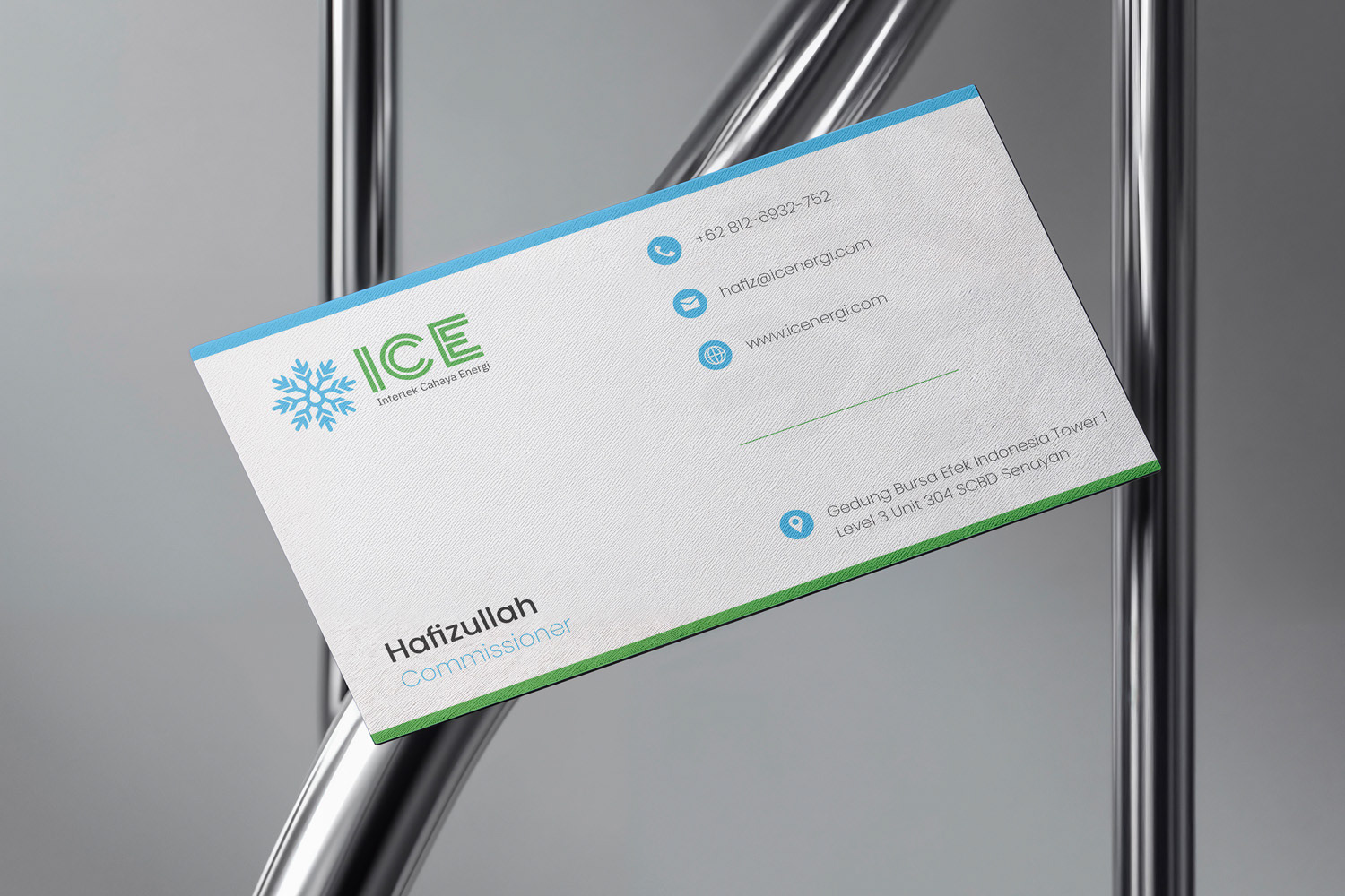
This logo was designed to reflect ICE’s core values: precision, reliability, technical expertise, and energy efficiency — while maintaining a clean, modern, and professional appearance suitable for a high-standard industrial environment.
Concept & Meaning
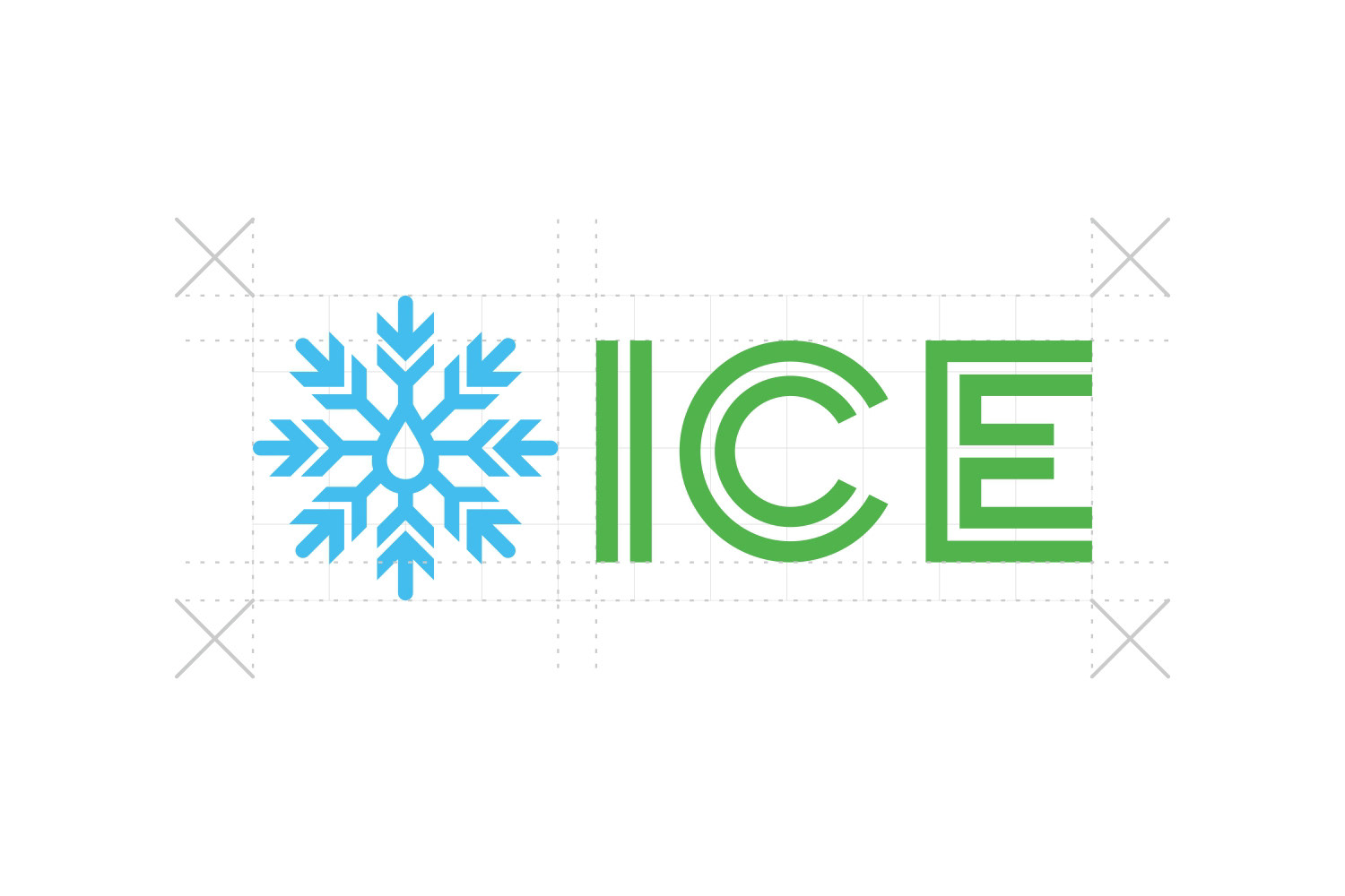
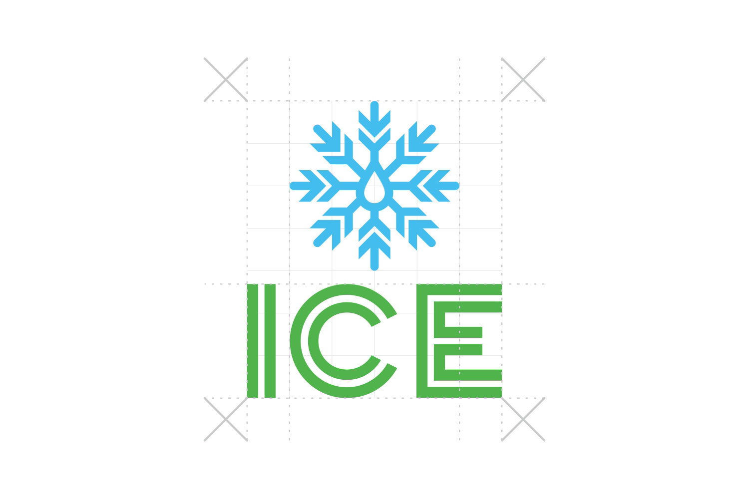
The snowflake-inspired symbol represents cooling systems, energy control, and technical precision, essential elements in oil & gas and industrial operations.
The droplet shape at the center symbolizes energy resources, fluid systems, and process flow — core aspects of EPC and pipeline industries.
The geometric symmetry reflects engineering accuracy, safety standards, and operational discipline.
The green typography conveys sustainability, growth, and environmental responsibility, while the clean sans-serif form reinforces a modern and corporate feel.
Design Goals
✔ Create a strong industrial identity
✔ Communicate technical reliability and professionalism
✔ Maintain clarity and scalability for large-scale industrial applications
✔ Ensure the logo works across digital, print, and site-level branding
✔ Maintain clarity and scalability for large-scale industrial applications
✔ Ensure the logo works across digital, print, and site-level branding
The result is a logo that feels technically solid, future-ready, and trustworthy, suitable for a national EPC company operating in complex and high-responsibility environments.