Wae — Screen Protector Packaging & Brand Identity Design
Wae is a local Indonesian screen protector brand created to offer premium protection with a modern and trustworthy visual identity. This project focuses on designing a packaging and branding system that communicates durability, quality, and technological reliability — while still looking elegant and retail-ready.
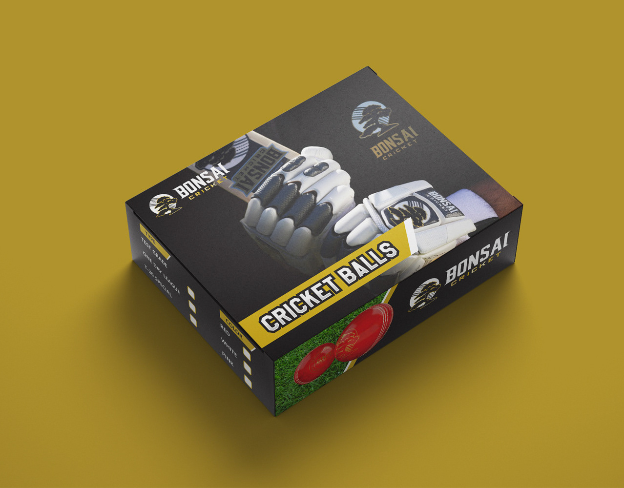
The visual direction combines a dark, premium color base with bold gold accents to give the brand a strong shelf presence and a high-end feel. Clean iconography and a clear layout system are used to communicate product features quickly and effectively, making it easy for customers to understand the value at a glance.
The logo and packaging were designed to be scalable across different product variants, device models, and future extensions — ensuring consistency and flexibility as the brand grows.
The result is a confident and modern brand identity that helps Wae stand out in a highly competitive tech accessory market, while maintaining a premium and professional appearance.


